
DgForm 表单组件
基础使用
:::demo
<template>
  <dg-form
    :config="formConf"
    @submit="onFormSubmit"
  >
  </dg-form>
</template>

<script setup lang="ts">
import { ConfigModel } from 'admin-component'
const formConf = reactive<ConfigModel>({
  model: {
    username: ''
  },
  areas: [
    {
      name: 'aboutInput',
      title: '',
      inline: false,
      visiable: true,
      fields: [
        {
          __config__: {
            type: 'text',
            label: 'Username',
            prop: 'username',
            required: true,
            rules: [
              {
                min: 3,
                max: 5,
                message: 'Length should be 3 to 5',
                trigger: 'blur',
              },
            ],
          },
        },
      ],
    },
  ],
})

const onFormSubmit = (v: any) => {
  console.log('submit values:', v)
}
</script>
:::
config 整体配置项
| 参数 | 类型 | 说明 | 可选值 | 默认值 |
|---|---|---|---|---|
| model | Object | 表单值 | - | |
| watch | (string | RegExp)[] | 监听指定prop的 value change,可通过@watch监听回调 | [] | |
| size | string | 全局配置组件的size | default,small,large | default |
| labelWidth | string | number | 全局配置labelWidth | auto | |
| labelWithColon | boolean | 全局配置是否在label后加冒号 | - | false |
| labelPosition | string | 全局配置label位置 | left,right,top | left |
| inline | boolean | 全局配置form-item布局是否为inline | false | |
| disabled | boolean | ComputedRef<boolean> | Ref<boolean> | 全局配置disabled | false | |
| showMessage | boolean | 是否显示校验错误信息 | false | |
| hideRequiredAsterisk | boolean | 是否隐藏必填的红色星号 | false | |
| scrollToError | boolean | 当校验失败时,滚动到第一个错误表单项 | false | |
| hideButtons | boolean | 是否隐藏表单底部默认操作按钮,默认有 提交/重置 | false | |
| buttons | {submit?: {hide?: boolean, text?: string}, reset?: {hide?: boolean, text?: string}} | 针对表单底部操作按钮提交/重置做显示/文字的配置 | ||
| areas | Array<AreaModel> | 区域数组,可以把相关表单项划分为一个个区域,样式上的分割 | - |
AreaModel 配置项
用于配置 config.areas = [AreaModel]
| 参数 | 类型 | 说明 | 可选值 | 默认值 |
|---|---|---|---|---|
| name | string | 区域名,用作forkey, 请保持值唯一 | - | |
| title | string | 标题名,不需要则设置为空 | ||
| inline | boolean | 配置区域内的form-item布局是否inline | false | |
| visiable | boolean | ComputedRef<boolean> | Ref<boolean> | 当前区域是否可见 | ||
| labelWidth | string | number | 配置区域块内的form-item的labelWidth | ||
| labelWithColon | boolean | 配置区域块内的label后是否加冒号 | false | |
| className | string | 配置区域的className | false | |
| disabled | boolean | ComputedRef<boolean> | Ref<boolean> | 配置区域块内的form-item的disabled | false | |
| keep | boolean | 当前区域不可见时,提交表单时是否返回当前区域内所有字段的值 | false | |
| fields | Array<FieldModel> | Field数组,配置各种类型的表单项 |
FieldModel 配置项
用于配置 config.areas = [{...AreaModel, fields: [FieldModel]}]
| 参数 | 类型 | 说明 | 可选值 | 默认值 |
|---|---|---|---|---|
| width | string|number | 表单项的总宽度 | ||
| style | Object | 设置表单项样式 | ||
| __config__ | Object | 一般放置跟form-item相关的属性,如label、rules等 | false | |
| __config__.prop | string | 表单项的字段名,多级用.分割,如“a.0.c” | ||
| __config__.type | string | 表单项的类型,比如input/单选/多选等,下面会详细介绍 | ||
| __config__.label | string | 表单项的label,非必填 | ||
| __config__.labelWidth | string | number | 表单项的labelWidth | ||
| __config__.labelWithColon | boolean | 表单项的label后是否加冒号 | ||
| __config__.visiable | boolean | ComputedRef<boolean> | Ref<boolean> | (fieldValue, formValue, prop) => boolean | 当前表单项是否可见 | ||
| __config__.required | boolean | ComputedRef<boolean> | Ref<boolean> | 表单项是否必填 | false | |
| __config__.keep | boolean | 表单项不可见时,提交表单时是否返回当前表单项字段的值 | false | |
| __config__.rules | Array | 表单项验证rules,rule规则可参考async-validator库 | ||
| __content__ | Object | 一般放置跟input相关的属性,如 placeholder,disabled等,不同类型可设置的属性不一样, 下面会详细介绍 | ||
| __content__.remark | string | 在表单项下方放置描述 | ||
| __fields__ | DynamicModel | 当type: 'dynamic'时,这里配置的是动态数组的配置项 | ||
| - | - | - | - | - |
| __area__ | AreaModel | 插入区域, 相当于嵌套划分区域 |
注意
__config__[包含其他] 和 __area__ 只能存在其中一个
Input 类型配置项
类型配置
__config__.type = 'text'
该类型的 __content__ 配置项有:
| 参数 | 类型 | 说明 | 可选值 | 默认值 |
|---|---|---|---|---|
| type | string | input的type | text,textarea | text |
| clearable | boolean | 是否可清除 | true | |
| disabled | boolean | ComputedRef<boolean> | Ref<boolean> | (formValue, prop) => boolean | 是否disabled | ||
| placeholder | string | placeholder | 请输入${__config__.label} | |
| rows | number | 当input.type=textarea时,显示行数 | 3 | |
| prepend | string | 输入框的前缀 | ||
| append | string | 输入框的后缀 | ||
| $attrs | Object | 具体看el-input的配置项 |
示例代码:
{
  __config__: {
    type: 'text',
    label: '普通Input',
    prop: 'inputValue',
  },
  __content__: {
    type: 'textarea',
    rows: 5,
    append: '后缀',
    placeholder: '请输入内容',
  }
}
Number 类型配置项
类型配置
__config__.type = 'number'
该类型的 __content__ 配置项有:
| 参数 | 类型 | 说明 | 可选值 | 默认值 |
|---|---|---|---|---|
| clearable | boolean | 是否可清除 | true | |
| disabled | boolean | ComputedRef<boolean> | Ref<boolean> | (formValue, prop) => boolean | 是否disabled | ||
| placeholder | string | placeholder | 请输入${__config__.label} | |
| precision | number | 数值精度 | 2 | |
| step | number | 计数器步长 | 1 | |
| min | number | 最小值 | ||
| max | number | 最大值 | ||
| controls | boolean | 是否使用控制按钮 | false | |
| $attrs | Object | 具体看el-input-number的配置项 |
示例代码:
{
  __config__: {
    type: 'number',
    label: '数值输入',
    prop: 'value',
  },
  __content__: {
    controls: true,
  }
}
Select 类型配置项
适用场景:
- 静态options
- 异步传入options
- 远程一次性请求所有options的场景
类型配置
__config__.type = 'select'
该类型的 __content__ 配置项有:
| 参数 | 类型 | 说明 | 可选值 | 默认值 |
|---|---|---|---|---|
| clearable | boolean | 是否可清除 | true | |
| disabled | boolean | ComputedRef<boolean> | Ref<boolean> | (formValue, prop) => boolean | 是否disabled | ||
| placeholder | string | placeholder | 请选择${__config__.label} | |
| multiple | boolean | 是否多选 | ||
| filterable | boolean | 是否可筛选 | true | |
| loading | boolean | ComputedRef<boolean> | Ref<boolean> | 是否正在从远程获取数据 | ||
| options | Array<{label: string, value: string|number}> | 选项 | ||
| api | ({formValue, prop}) => Promise<options> | 远程请求api, 适用于一次性加载全部数据 | ||
| focus | () => void | 当input获得焦点时触发 | ||
| visibleChange | (visible: boolean) => void | 当下拉框出现/隐藏时触发 | ||
| $attrs | Object | 具体看el-select的配置项 |
示例代码:
{
  __config__: {
    type: 'select',
    label: '选择器',
    prop: 'value',
  },
  __content__: {
    // options: optionsRef,
    // loading: loadingRef,
    options: [
      {
        value: 'Option1',
        label: 'Option1',
      },
      {
        value: 'Option2',
        label: 'Option2',
      },
      {
        value: 'Option3',
        label: 'Option3',
      },
      {
        value: 'Option4',
        label: 'Option4',
      },
      {
        value: 'Option5',
        label: 'Option5',
      },
    ]
  },
},
{
  __config__: {
    type: 'select',
    label: '选择器From API',
    prop: 'selectFromApi',
  },
  __content__: {
    api: (v: any) => {
      console.log('Selector From Api', v)
      return new Promise(resolve => {
        setTimeout(() => {
          resolve([
            {
              value: 'Option1',
              label: 'Option1',
            },
            {
              value: 'Option2',
              label: 'Option2',
            },
            {
              value: 'Option3',
              label: 'Option3',
            },
            {
              value: 'Option4',
              label: 'Option4',
            },
          ])
        })
      })
    },
  }
}
SelectRemote 类型配置项
适用于需要远程分页请求options的场景
类型配置
__config__.type = 'selectRemote'
该类型的 __content__ 配置项有:
| 参数 | 类型 | 说明 | 可选值 | 默认值 |
|---|---|---|---|---|
| clearable | boolean | 是否可清除 | true | |
| disabled | boolean | ComputedRef<boolean> | Ref<boolean> | (formValue, prop) => boolean | 是否disabled | ||
| placeholder | string | placeholder | 请选择${__config__.label} | |
| api | (params) => Promise<{data: any[]}> | 远程方法 | ||
| labelKey | string | label的key | ||
| valueKey | string | value的key | ||
| queryKey | string | 搜索keyword的prop | ||
| defaultItem | Object | |||
| editorItem | Object | 编辑时传入的editorItem | ||
| rq | ||||
| labelSlot | ||||
| multiple | boolean | 是否多选 | ||
| listenFullDataSelected | (data) => void | 监听已选择data的回调 | ||
| $attrs | Object | 具体看dg-selector-remote的配置项 |
示例代码:
{
  __config__: {
    type: 'selectRemote',
    label: '远程分页选择器',
    prop: 'value',
  },
  __content__: {
    multiple: true,
    api: () => Promise({data: []}),
    labelKey: 'name',
    queryKey: 'name',
    $attrs: {
      collapseTags: true,
    },
  },
}
Date 类型配置项
类型配置
__config__.type = 'date'
该类型的 __content__ 配置项有:
| 参数 | 类型 | 说明 | 可选值 | 默认值 |
|---|---|---|---|---|
| type | string | 显示类型 | 具体看el-date-picker的type | date |
| clearable | boolean | 是否可清除 | true | |
| disabled | boolean | ComputedRef<boolean> | Ref<boolean> | (formValue, prop) => boolean | 是否disabled | ||
| placeholder | string | placeholder | 请选择${__config__.label} | |
| format | string | 显示在输入框中的格式 | YYYY-MM-DD | |
| valueFormat | string | 绑定值的格式 | YYYY-MM-DD | |
| min | string | 最小日期,若为今天可直接传入'today' | ||
| max | string | 最大日期,若为今天可直接传入'today' | ||
| startPlaceholder | string | 范围选择时开始日期的占位内容 | 请选择开始时间 | |
| endPlaceholder | string | 范围选择时结束日期的占位内容 | 请选择结束时间 | |
| disabledDate | (date: string) =>boolean | 一个用来判断该日期是否被禁用的函数 | min和max区间(若有传入) | |
| $attrs | Object | 具体看el-date-picker的配置项 |
示例代码:
{
  __config__: {
    type: 'date',
    label: '选择大于今天的日期',
    prop: 'dateAfterToday',
  },
  __content__: {
    // max: '2022-03-15',
    min: 'today',
    remark: '此处限制选择大于等于今天的日期,max/min是YYYY-MM-DD格式, 为了方便,提供了“today”值使用',
  },
},
{
  __config__: {
    type: 'date',
    label: '选择日期范围',
    prop: 'dateRange',
  },
  __content__: {
    type: 'daterange',
  },
},
{
  __config__: {
    type: 'date',
    label: '选择DateTime',
    prop: 'dateTime',
  },
  __content__: {
    type: 'datetime',
  },
}
Radio 类型配置项
有以下几种UI类型:
- 普通radio样式
- button样式
- 图片样式
类型配置
__config__.type = 'radio'
该类型的 __content__ 配置项有:
| 参数 | 类型 | 说明 | 可选值 | 默认值 |
|---|---|---|---|---|
| type | string | UI类型 | image,button | - |
| options | Array<{ value: string; label: string }> | 选项 | ||
| disabled | boolean | ComputedRef<boolean> | Ref<boolean> | (formValue, prop) => boolean | 是否disabled | ||
| placeholder | string | placeholder | 请选择${__config__.label} | |
| imageWidth | string | 图片宽(type=image时适用) | 100px | |
| imageHeight | string | 图片高(type=image时适用) | 140px | |
| imageFit | string | 图片如何适应容器框(type=image时适用) | cover | |
| $attrs | Object | 具体看el-radio的配置项 |
示例代码:
{
  __config__: {
    type: 'radio',
    label: '普通Radio',
    prop: 'radio',
  },
  __content__: {
    options: [
      {
        value: 'Option1',
        label: 'Option1',
      },
      {
        value: 'Option2',
        label: 'Option2',
      },
      {
        value: 'Option3',
        label: 'Option3',
      },
      {
        value: 'Option4',
        label: 'Option4',
      },
      {
        value: 'Option5',
        label: 'Option5',
      },
    ],
  },
},
{
  __config__: {
    type: 'radio',
    label: 'Radio Button',
    prop: 'radioButton',
  },
  __content__: {
    type: 'button',
    options: [
      {
        value: 'Option1',
        label: 'Option1',
      },
      {
        value: 'Option2',
        label: 'Option2',
      },
      {
        value: 'Option3',
        label: 'Option3',
      },
      {
        value: 'Option4',
        label: 'Option4',
      },
      {
        value: 'Option5',
        label: 'Option5',
      },
    ],
  },
},
{
  __config__: {
    type: 'radio',
    label: 'Radio for Image',
    prop: 'radioImg',
  },
  __content__: {
    type: 'image',
    options: [
      {
        value: 'Option1',
        label:
          'https://gimg2.baidu.com/image_search/src=http%3A%2F%2Fww3.sinaimg.cn%2Fmw690%2Fe61e06ccly1gw8d8a7m7yj20u018zq8k.jpg&refer=http%3A%2F%2Fwww.sina.com&app=2002&size=f9999,10000&q=a80&n=0&g=0n&fmt=jpeg?sec=1647757986&t=f3f1d9b7ae4ef849b23539fb4665776f',
      },
      {
        value: 'Option2',
        label:
          'https://gimg2.baidu.com/image_search/src=http%3A%2F%2Fn.sinaimg.cn%2Fsinakd20200409ac%2F289%2Fw690h1199%2F20200409%2Fb300-iryninw7565610.jpg&refer=http%3A%2F%2Fn.sinaimg.cn&app=2002&size=f9999,10000&q=a80&n=0&g=0n&fmt=jpeg?sec=1647755744&t=a6d8f04cbe8433a84f591d0214f2fcc3',
      },
      {
        value: 'Option3',
        label:
          'https://gimg2.baidu.com/image_search/src=http%3A%2F%2Fb-ssl.duitang.com%2Fuploads%2Fitem%2F201808%2F04%2F20180804234036_FZFQj.thumb.700_0.jpeg&refer=http%3A%2F%2Fb-ssl.duitang.com&app=2002&size=f9999,10000&q=a80&n=0&g=0n&fmt=jpeg?sec=1647757902&t=687a56e93ab1ab321fe9dd351bdea262',
      },
      {
        value: 'Option4',
        label:
          'https://gimg2.baidu.com/image_search/src=http%3A%2F%2Fnimg.ws.126.net%2F%3Furl%3Dhttp%3A%2F%2Fdingyue.ws.126.net%2F2021%2F0517%2Fc186393ap00qt7rc801gfc000u00190c.png%26thumbnail%3D650x2147483647%26quality%3D80%26type%3Djpg&refer=http%3A%2F%2Fnimg.ws.126.net&app=2002&size=f9999,10000&q=a80&n=0&g=0n&fmt=jpeg?sec=1647757986&t=622cb5c7a365f1021b7394c3e8ea2648',
      },
      {
        value: 'Option5',
        label:
          'https://gimg2.baidu.com/image_search/src=http%3A%2F%2Fpic1.zhimg.com%2Fv2-d6141b49a7f08d02f9ed155c66ad44be_1440w.jpg%3Fsource%3D172ae18b&refer=http%3A%2F%2Fpic1.zhimg.com&app=2002&size=f9999,10000&q=a80&n=0&g=0n&fmt=jpeg?sec=1647757986&t=39889a78077959bd648b8e90cad427d1',
      },
    ],
  },
}
Checkbox 类型配置项
类型配置
__config__.type = 'checkbox'
该类型的 __content__ 配置项有:
| 参数 | 类型 | 说明 | 可选值 | 默认值 |
|---|---|---|---|---|
| options | Array<{ value: string; label: string }> | 选项 | ||
| disabled | boolean | ComputedRef<boolean> | Ref<boolean> | (formValue, prop) => boolean | 是否disabled | ||
| $attrs | Object | 具体看el-checkbox的配置项 |
示例代码:
{
  __config__: {
    type: 'checkbox',
    label: 'Checkbox',
    prop: 'checkbox',
  },
  __content__: {
    options: [
      {
        value: 'Option1',
        label: 'Option1',
      },
      {
        value: 'Option2',
        label: 'Option2',
      },
      {
        value: 'Option3',
        label: 'Option3',
      },
      {
        value: 'Option4',
        label: 'Option4',
      },
      {
        value: 'Option5',
        label: 'Option5',
      },
    ],
  },
}
Cascader 类型配置项
类型配置
__config__.type = 'cascader'
该类型的 __content__ 配置项有:
| 参数 | 类型 | 说明 | 可选值 | 默认值 |
|---|---|---|---|---|
| props | Object | 配置选项 | ||
| options | Object | 选项的数据源 | ||
| showAllLevels | boolean | 输入框中是否显示选中值的完整路径 | ||
| clearable | boolean | 是否可清除 | true | |
| disabled | boolean | ComputedRef<boolean> | Ref<boolean> | (formValue, prop) => boolean | 是否disabled | ||
| $attrs | Object | 具体看el-cascader的配置项 |
示例代码:
{
  __config__: {
    type: 'cascader',
    label: 'Cascader',
    prop: 'cascader',
  },
  __content__: {
    showAllLevels: false,
    props: {
      expandTrigger: 'hover',
    },
    options: [
      {
        value: 'guide',
        label: 'Guide',
        children: [
          {
            value: 'disciplines',
            label: 'Disciplines',
            children: [
              {
                value: 'consistency',
                label: 'Consistency',
              },
              {
                value: 'feedback',
                label: 'Feedback',
              },
              {
                value: 'efficiency',
                label: 'Efficiency',
              },
              {
                value: 'controllability',
                label: 'Controllability',
              },
            ],
          },
        ],
      },
    ],
  },
}
Upload 类型配置项
类型配置
__config__.type = 'upload'
该类型的 __content__ 配置项有:
| 参数 | 类型 | 说明 | 可选值 | 默认值 |
|---|---|---|---|---|
| accept | string | 接受文件类型 | ||
| listType | string | 文件列表的类型(注意:当设为picture时是单个文件,传入值为字符串) | text,picture,picture-card | picture-card |
| multiple | boolean | 是否支持多选文件 | true | |
| isCrop | boolean | 是否开启剪裁 | false | |
| stencilProps | Object | 裁剪比率等相关设置 | ||
| showFileList | boolean | 是否显示已上传文件列表 | true | |
| limit | number | 最多上传N个文件 | ||
| disabled | boolean | ComputedRef<boolean> | Ref<boolean> | (formValue, prop) => boolean | 是否disabled | ||
| $attrs | Object | 具体看dg-upload的配置项 |
示例代码:
上传多个图片 示例
{
  __config__: {
    type: 'upload',
    label: 'Upload Images',
    prop: 'uploadImages', //值为数组
  },
  __content__: {},
}
上传单个图片 示例
{
  __config__: {
    type: 'upload',
    label: 'Upload Single Image',
    prop: 'uploadSingle', //值为字符串
  },
  __content__: {
    listType: 'picture',
    showFileList: false,
    multiple: false,
  },
}
上传文件 示例
 {
   __config__: {
    type: 'upload',
    label: 'Upload Files',
    prop: 'uploadFiles', //值为数组
  },
  __content__: {
    listType: 'text',
    accept: '.doc, .docx, .pdf, .xls, .xlsx',
  },
}
纯文本 类型配置项
类型配置
__config__.type = 'plainText'
该类型的 __content__ 配置项有:
| 参数 | 类型 | 说明 | 可选值 | 默认值 |
|---|---|---|---|---|
| className | Array<string> | 文本的className | ||
| renderTextStyle | Object | 文本style | {} | |
| renderText | (value, formValue, prop) => string | 自定义文本, 支持返回html string(默认显示字段值) |
示例代码:
{
  __config__: {
    type: 'plainText',
    label: '纯文本',
    prop: 'plainText1',
  },
  __content__: {
    renderTextStyle: { color: 'blue' },
  },
},
{
  __config__: {
    type: 'plainText',
    label: '纯文本(自定义html)',
    prop: 'plainText1',
  },
  __content__: {
    renderText: (value: string, formValue: any, prop: string) => {
      console.log('renderText', value, formValue, prop)
      return `<div style="color: red; background: yellow;">${value}</div>`
    },
  },
},
自定义组件 类型配置项
类型配置
__config__.type = 'custom'
配置示例代码:
{
  __config__: {
    type: 'custom',
    label: '自定义formItem内容',
    prop: 'customcontet',
  },
}
组件slot示例代码:
<dg-form>
  <template #customcontet="ctx">
    <span style="margin-right: 10px">当前时间: {{ ctx.value || '未获得' }}</span>
    <el-button type="primary" round size="small" @click="() => ctx.setValue(+new Date())">获取当前时间</el-button>
  </template>
</dg-form>
其中 slot 的参数有:
| 参数 | 类型 | 说明 |
|---|---|---|
| name | string | 当前propName |
| field | Object | 当前表单项的配置(即上述的FieldModel) |
| config | Object | 整个表单的配置 |
| value | any | 当前表单项的值 |
| setValue | (value) => void | 用于设置当前表单项的值的方法 |
动态数组 类型配置项
类型配置
__config__.type = 'dynamic'
该类型的 __content__ 配置项有:
| 参数 | 类型 | 说明 | 可选值 | 默认值 |
|---|---|---|---|---|
| disabled | boolean | 配置数组里所有表单项的disabled |
该类型的 __fields__ 配置项有:【即上述的DynamicModel类型】
| 参数 | 类型 | 说明 | 可选值 | 默认值 |
|---|---|---|---|---|
| items | Array<FieldModelForDynamic> | 配置数组Item内的表单项,详情见下方 | ||
| itemWidth | string | 数组Item的宽度 | ||
| inline | boolean | [数组Item之间]布局是否inline | ||
| itemsInline | boolean | 数组Item里[表单项之间]布局是否inline | ||
| title | string|(arrayValue, index) => string | 数组Item的标题 | ||
| hideTitle | boolean | 是否显示标题 | false | |
| min | number | 至少要有N个 | ||
| max | number | 最多可添加N个 | ||
| addBtnText | string | 添加按钮文本 | 添加 | |
| hideAddBtn | boolean | 是否隐藏添加按钮 | ||
| hideDeleteBtn | boolean | 是否隐藏删除按钮 | ||
| initItemData | Object | 添加时Item给定的默认值 | {} | |
| extraFields | string[] | 加入指定的其他字段(没有配置在Array Item里的字段, 但需要返回的字段) | ||
| keyPropOfItems | string | 指定数组Item的某个字段作为for循环的key |
其中该类型的 __fields__.items 配置项有:【即上述的FieldModelForDynamic类型】
注意
大体的配置项跟上述的 「FieldModel 配置项」一样,下面只列出不同的配置项
| 参数 | 类型 | 说明 | 可选值 | 默认值 |
|---|---|---|---|---|
| __config__.visiable | boolean | (arrayValue, index, prop) => boolean | 当前数组Item里的当前表单项 是否可见, 其中arrayValue为数组的值,index为当前位于数组的位置,prop为当前表单项的prop; | ||
| __content__.disabled | boolean | (arrayValue, index, prop) => boolean | 当前数组Item里的当前表单项 是否disabled |
其他
如果想要整体监听数组某个item的指定prop的value变化,可以配置
watch: ['dynamicEasyArr.0.text', 'dynamicArr.0.projectName']
甚至可以使用Regex监听数组下所有item的指定prop的value的变化,如
watch: [/dynamicArr2.\d+.method$/g]
示例代码:
{
  __config__: {
    type: 'dynamic',
    prop: 'dynamicArr',
  },
  __content__: {
    disabled: false
  },
  __fields__: {
    max: 9,
    min: 1,
    title: (_, index: number) => {
      return `检查项目${index + 1}`
    },
    hideTitle: false,
    inline: false,
    // itemWidth: '40%',
    addBtnText: '添加检查项目',
    initItemData: {
      projectName: '11',
      projectResult: '222',
    },
    items: [
      {
        __config__: {
          type: 'input',
          prop: 'projectName',
          required: true,
          label: '项目名称',
        },
      },
      {
        __config__: {
          type: 'input',
          label: '检查结果',
          prop: 'projectResult',
        },
        __content__: {
          disabled: ((fieldModel: any, index: any, prop: string) => {
            return !fieldModel[index].projectName || dynamicArrDisabled.value
          }) as any,
        },
      },
      {
        __config__: {
          type: 'input',
          label: '备注',
          prop: 'remark',
          required: true,
          visiable: ((fieldModel: any, index: any, prop: any) => {
            return !!fieldModel[index].projectResult
          }) as any,
        },
      },
    ],
  },
}
DEMO 截图: 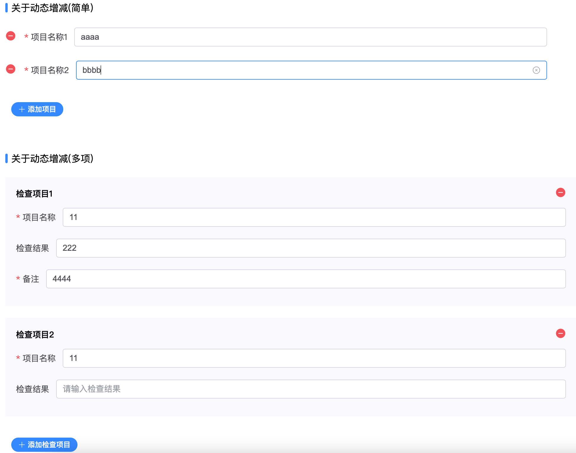
Events
| 名称 | 说明 | 回调参数 |
|---|---|---|
| watch | 当config.watch里的props发生value change时触发 | { prop: 字段名(具体来说:字段名路径), value: 新值 } |
| submit | 提交表单时触发 | 验证通过后formValue(只返回可见字段) |
| reset | 重置表单时触发 | 重置后的formValue(只返回可见字段) |
Slots
| 名称 | 说明 | 参数 |
|---|---|---|
| buttons | 表单底部增加自定义按钮 | - |
| append_${propName} | 给指定prop添加自定义后缀 | field: 当前表单项的配置即上述的FieldModel |
| ${propName} | 自定义组件 | {name: 当前propName, field: 当前表单项的配置即上述的FieldModel, config: 整个表单的配置, value: 当前表单项的值, setValue: 用于设置当前表单项的值的方法} |
方法
| 名称 | 说明 | 参数 | 返回值 |
|---|---|---|---|
| submit | 提交表单 | - | Promise<formValue> |
| reset | 重置表单 | - | Promise<formValue> |